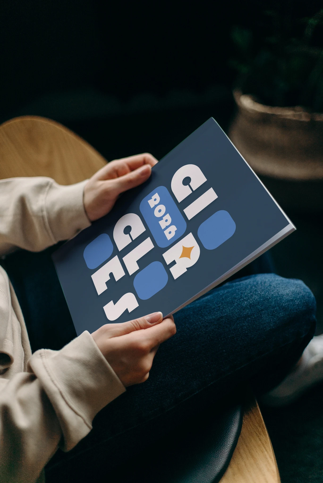
Event Branding · Editorial Design · Digital · Visual Identity
Circles is an independent branding exploration inspired by the visual language of the Circles conference. This project was created as a design exercise focused on developing a cohesive identity for an event and translating that identity across multiple applications.
The Concept
The goal was to create an identity that felt energetic, contemporary, and adaptable while maintaining a strong visual connection between each application.
I explored repetition, shape, typography, and composition as ways to create a system that could shift between different formats without losing its identity.
Visual System
The identity uses a modular graphic system that allows individual elements to be rearranged and combined across different layouts. Typography and geometric forms provide consistency, while variations in scale and composition keep the applications from feeling repetitive.
Applications
The system was developed across event materials including promotional graphics, editorial pieces, and digital applications.
Each format presented a different opportunity to test how the identity could communicate information while maintaining a consistent visual language.
Final Outcome
Circles became an exploration of how a flexible visual system can create consistency across an event experience without requiring every application to look exactly the same.
Project Type: Independent Design Exercise
Disciplines:
Event Branding · Visual Identity · Editorial Design · Digital Design
Tools:
Adobe Illustrator · Adobe InDesign · Adobe Photoshop